Fonts in Focus: Visual Text Guidelines
While font choice and text sizing options won’t offer access to everyone, like users who are fully blind, they are a great way to easily make your content much more accessible to the majority of people visiting your site or app.
 Advertisement
Accessible Visual Communication: Fonts Come First
Font choice, font size and font color choices are fundamental aspects of information accessibility on digital platforms, impacting how easily users can visually perceive and interpret text-based data on websites and mobile apps. Digital interface users will encounter a range of visual experiences, both pleasant and less so. Selecting appropriate fonts and sizes as well as text and background colors that work well together keeps content accessible for more of your site and app users, including visitors with visual impairments. These front-end text elements, when designed, coded, and implemented correctly, make for more inclusive and user-friendly electronic and online environments.

Laying Out the Facts: How to Set Legible, Readable Text
Creating a smooth user experience on any website relies on clear, concise communication. making text easy to recognize and easy to understand comes first. Grasping these subtle differences is crucial, especially when designing websites and digital media.
Legibility: What Does It Mean?
Legibility is the most basic foundation of intelligible text-based communication. Can people readily distinguish and comprehend the letters and words visible on the page? If users struggle to tell “b” from “d,” and it’s because of the font you chose rather than any cognitive impairment, you’ve created a problem, not content. Factors like font size, contrast, and character design all play a part in whether text is legible or not. And, although not all users have dyslexia, you certainly should use fonts that have letters that are as clearly differentiated as possible. Designing for the widest possible audience leads to a better user experience for everyone.
Who’s responsible for making online text legible? Anyone on the design team who is choosing fonts and styles.
Then… What Is Readability?
Readability is the next stage of understanding. How easily can users process and grasp your overall message, as well as individual words and sentences in your text? Here, aspects like line length, spacing, font style, word and font arrangement, and vocabulary complexity come into play. Readable text flows smoothly and naturally; it has enough “white space” around it to feel open, inviting readers to freely engage rather than leaving them struggling to decipher.
Whose job is it to make text digital content readable? It’s a shared task with multiple stakeholders: content creators and copywriters, graphic, web or UX designers, and developers implementing design functionality.
Legible + Readable: When Every Word & Letter Swoop Counts
An excellent everyday example of one type of text that must be both legible and effortlessly readable is transit system signage. People count on finding their way through complex urban environments by using these directional markers.
In 1970, two young designers from Unimark International completed a monumental task: a redesigned Graphics Standards Manual for the New York City Transit Authority, based on previous standardization for signage and wayfinding in the 60s. Bob Noorda and Massimo Vignelli’s 174-page guide introduced the iconic design system that can still be seen in the Big Apple today: the renowned sans-serif typeface Helvetica for all signage, and circles with bold letters and strong color-coding for all train route identification, as well as a pocket map version with a system diagram and a key. This visual identity overhaul solved the confusion caused by old signs and ways of communicating jostling side-by-side in a cluttered mishmash with new ones following the 1940’s BMT – IND merger.

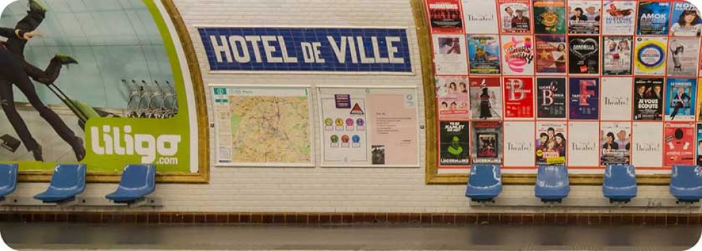
Mind the Gap Between Legibility & Readability
The London Underground’s own typeface, the Johnston font, now instantly recognizable, has always been immediately readable. Used throughout London’s railway system, Johnston is probably best known as part of what’s called the roundel, the enduring red circle crossed by a blue stripe logo whose first incarnation appeared in 1905. The latest iteration of the Johnston font was born at the Monotype foundry in 2016; Johnston100 is a centennial refresh to the font used since 1916, standardizing characters like @ and offering new thin and hairline font weights.
What Makes Sans Serif Fonts So Readable?
Sans Serif Typography in the Big Smoke & Beyond
The clean fonts made famous in Londontown have come to symbolize England and the United Kingdom for many.
Expert Opinion: In a BBC interview, Donna Steel, curator of an East Sussex Johnston exhibition, said that fonts with serifs can make text “more difficult to read, there's more for the eye to take on.”
Conversely, Johnston Sans, with its simplicity and readability, Steel sees as “reassuring, which is so important when we're traveling, because when we're traveling we're vulnerable. With Johnston, the typeface is confident and it reassures us. We know when we've got the right place and his message is clear.”
Certainly this was Johnston’s intention. In his Formal Penmanship and other papers, 1971, Edward Johnston said:
We aim at readableness or making the written words easy and pleasant to read.This, then, is the scribe’s direct purpose – The making of useful things legibly beautiful
A worthy aim. We salute Mr. Johnston and his admirable legacy: London’s lettering.
Much less noble but certainly successful, Johnston’s pupil, Eric Gill, used Johnston Sans as the groundwork to create Gill Sans; The font was then commissioned for development by the Monotype foundry. Penguin Books used Gill Sans for their classic jacket design. It is also the font of the BBC and Rolls-Royce logos, as well as the Tommy Hilfiger and Philips brands. The font’s functionality seems to surpass the bothers people give about the type designer’s morals.
Helvetica Highs: From the Swiss Alps to the NY Skyline
The Helvetica sans-serif font was originally crafted in Switzerland. It was chosen to replace the New York City Subway’s older font, Standard, also known as Akzidenz-Grotesk. Although Standard was originally voted in by the subway design team, with a 60’s-era manual considering Standard Medium to “offer the easiest legibility from any angle,” Helvetica won out based on how it clearly differentiated certain letters, particularly the letter J. So, part of Helvetica’s readability is also based on its legibility: its clarity and ease of recognition of certain letters that might otherwise be confused. Massimo Vignelli, the NYC subway signage designer, also used Helvetica for the brand identity he created for American Airlines in 1967.
Highway to Helvetica: Analog to Digital
Helvetica is used today for so many purposes and by so many major corporations that it feels like a natural part of our modern environment. It’s implemented everywhere simply because it is thought of as neutral, as is the country for which it is named. And like the Instagrammed-to-death sad beige lifestyle influencer color choices, Helvetica has gotten its fair share of loathing from designers as well. Is Helvetica forgettable? Boring? Maybe. Is it a “too safe” choice? That’s possible. Or is it, perhaps, not beige but that unmissable essential: the “little black dress” of fonts.
Can Helvetica be a font choice that negatively impacts functional readability? Now there’s a point of contention: although Helvetica was initially chosen for its legibility, in part because of its uniform structure,some think it poses issues due to lack of contrast in shape rhythm and letter spacing. That’s more of a minority opinion, however.
Expert Opinions: Stephen Coles, a typography expert based in San Francisco, brings the Helvetica readability decision back to how the font is used and where it is displayed. In his view, Helvetica can be a fine font, when optimally implemented. Nikita Prokhorov, a lettering artist and graphic designer in Brooklyn, has suggested that Helvetica may be overused because it is so well-designed. That seems fair enough. We can’t quite blame a font for being so nearly perfect that it’s become ubiquitous.
Helvetica, so heavily used in signage, wayfinding, and brand identity, is also used very frequently in web design. The version of Helvetica we’re familiar with is Neue Helvetica, the 1983 update of Linotype’s Helvetica font. Steve Jobs chose it as an included font packaged with the very first Apple Macintosh computer.
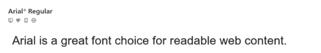
Possibly even more popular than Helvetica online and in digital forms of media is its slightly softer, rounder, less elegant sibling: Arial. Originally known as Sonoran Sans Serif, Arial was forged for the Monotype font foundry as part of an IBM contract agreement to create bitmap fonts for the first printers IBM manufactured for office use. Circa early 90s, Arial was chosen by Microsoft as one of four baseline TrueType fonts for Windows 3.1. This choice was based on very pragmatic licensing price points.
Are Arial and Helvetica rivals, as Microsoft and Apple are? Not really. They’re more equal at this point, and each has its advantages and uses. Is Arial more plebeian? Perhaps, but it’s effective. Arial works, too.
Some Other Sans Serif Stars With Accessible Eye Appeal
Planning and building content, layout and style while keeping all your potential end users front of mind, with the intention of providing access to all, is the best and most successful approach: it’s known as universal design, and it’s highly recommended for compliance with accessibility regulations in the United States and around the world. Selecting fonts that are both legible and readable is a foundational part of creating a positive user experience for the widest possible audience, including people with dyslexia, who need clearly defined and differentiated characters. Ultimately, acting on universal design principles means offering not just accessibility but a real welcome to everyone who interacts with your content or platform.
Let’s take a glance at some highly readable sans serif fonts often used for clear digital and online communication:
Yes, Arial was eclipsed by Calibri as the default Office font circa 2007. But this widely recognized sans-serif font is still solid: it boasts clean lines and open letterforms, making it easy for readers to distinguish between its characters. Designed in 1982 as a screen-based substitute for Helvetica, and known for its versatility and clarity on both digital and print platforms, Arial’s clean style offers excellent readability across platforms.
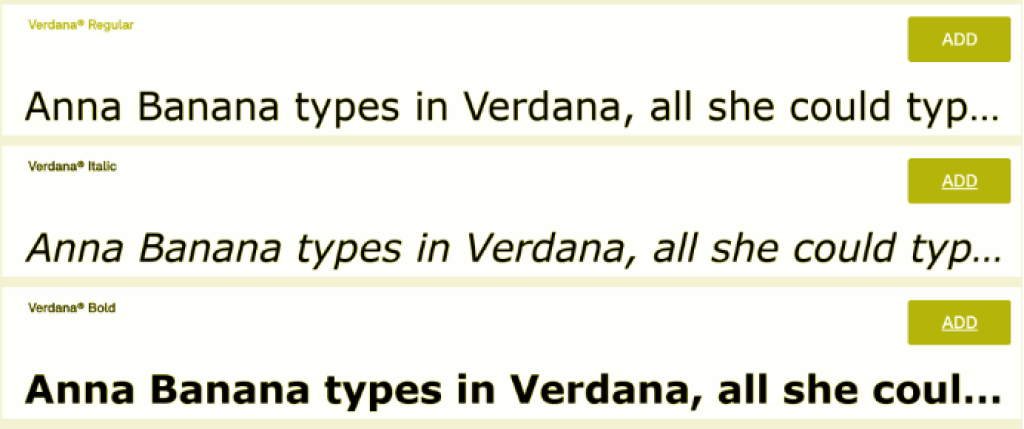
Developed by Matthew Carter for Microsoft circa 1996, Verdana resembles classic sans serif fonts such as Frutiger and the London Underground’s Johnston typeface. One of the earliest screen fonts, Verdana was designed with a focus on legibility and readability at small sizes on computer screens, with a focus on distinguishability for lower case i, j and l and upper case I, J and L, and the number 1. Its generous letter spacing, tall lowercase letters, and slightly wider characters contribute to its ease of reading on digital displays. Verdana is at its best when used for mobile websites, where screen space is limited and type sizes run small. It did cause a hullabaloo when it was briefly chosen in August 2009 by IKEA over the elegant, classic Futura. Verdana remains a practical font choice in several screen-based scenarios, and has been tapped as the go-to for tiny text disclaimers and dense blocks of legalese on your site.
Tahoma is another Microsoft font created by Matthew Carter in the 90s. It shares similar characteristics with Verdana but has a narrower body, tighter letter spacing, and a more compact appearance. With good legibility and readability on screens and in print, its slightly condensed design can be advantageous for maximizing space on smaller screens. Tahoma is a common choice for user interface design because of its clear distinction between letters. Tahoma’s bold weight, built on double pixel width, is also very readable, making it a good standout text option for digital environments.
Each of the popular fonts above are considered fully accessible, legible, and readable, improving the user experience throughout the digital domain. There are, of course, tens of thousands of other fonts available. As any designer knows, font choice is the ultimate rabbit hole. it's best not to venture too far down; there are so dang many. Your best bet is finding multiple fonts that have been praised for readability, and then deciding which fits your design.
Fonts That Just Won’t Work for Web Accessibility
Certain fonts are less suitable for legibility, readability, and accessibility, especially for users with dyslexia. Although they can be aesthetically pleasing and a lot of fun to use, fonts with intricate details, excessive decoration, or irregular shapes can hinder readability.
Gothic, Script & Decorative or Display Fonts
Keep these for tattoos, wedding invitations, and band logo designs. These fonts may have unusual shapes, elaborate swirls and sharp edges that can merge letters together, making them exceptionally difficult to read.
Fonts with Similar Letter Shapes
Fonts where letters or numbers look too similar to each other may confuse many readers, even if they don’t have a disability. Typical characters that can look interchangeable visually, but aren’t: ‘I' and ‘l', or ‘O' and ‘0'.
Eyeball It: How to Visually Classify “Display” Fonts
If you’re more of a TikTok person, take a quick glance at this very short video about different kinds of fonts, including serif, sans, and display. You’ll quickly grasp why display fonts are a completely unreadable font style for many readers. And, like art and other visual forms of expression, what’s a display font? Well, you’ll know it when you see it.
Remember: Not all users can see your fonts or designs; they may be visually impaired or blind. For the ones who can see your content, don’t assume they can easily understand what’s written if it isn’t super clear and legible.
Fonts To Avoid, In General
Legendary for the amount of red-faced spluttering they precipitate among anyone in design, these sans-serif fonts are popular enough among the general public. If they’re readable and fun to use, why stay away? Well, there are reasons, but they involve style and good taste, not accessibility. So, make your choice accordingly.
Comic Sans MS: Two Thumbs Down for Style
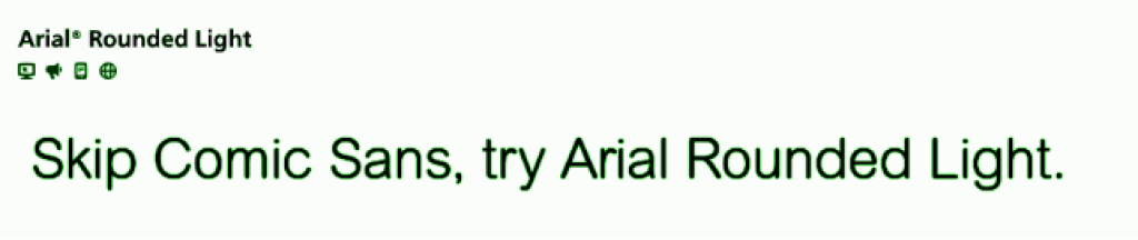
It’s perfectly all right to use Comic Sans to set up a Lemonade $1.00 sign for your 5-year old nephew. That’s about it for appropriate styling. On the other hand, if your aim is only to provide legible text for readers with dyslexia, and you don’t care about aesthetics, Comic Sans is actually recommended by the British Dyslexia Association (BDA) as it is less crowded in its letterforms. It says nothing about spacing between Comic Sans characters, though, and that may be more significant in terms of readability. The BDA also recommends a few less goofy-looking fonts, such as Verdana and Tahoma, which we’ve already mentioned, plus Century Gothic, Trebuchet, Calibri, and Open Sans. Or, for a light and relaxed feel without the messy look of Comic Sans, try Arial Rounded or Arial Rounded Light.
Papyrus
Ah Papyrus, what can we say, old friend? Reddit users expressed it succinctly.
One said: “It’s overused. It’s dated. It’s messy. And I’ve never seen it used well. It always seems to be used to denote something that is old but it just looks so fake.”
Another user said, and I think we can all agree: “When I see papyrus, I assume you are making and selling your own soap, or are a 2nd grade teacher doing a unit on Asia.” That does bring back some memories.While Papyrus may have been selected as a base for the Avatar movie logo, it isn’t readable, it isn’t clear in what it communicates, and it’s a running joke at this point: it made an appearance in a 2017 Saturday Night Live sketch with Ryan Gosling starring as a graphic designer haunted by Avatar’s Papyrus font choice.
Impact
It’s a sans-serif, but do we recommend it? Not exactly a yes or no answer, but we’re leaning towards a No.
Why? Impact is blocky and tightly set, which can impact (ahem) its readability when used in longer text segments, or at small sizes. In short, it’s wearing on the eyes when used for anything more than a brief line.
And, it’s been run into the ground, starting in the mid-90s and really hitting its stride around 1998 when Microsoft pushed it pretty hard. It still works for some situations. We suggest using it sparingly.
Is Impact totally played out? Not in the meme world, it isn’t. It’s the shopworn yet unstoppable meme font format born on I Can Has Cheezburger? (ICHC), once one of the most popular sites on the internet, with up to a million and a half hits a day at its peak popularity, in 2007. ICHC helped make pet-focused image macros and the perhaps regrettable lolspeak mainstream, and, incidentally, monetized online memes. This history is relevant for accessibility and readability purposes today for both world-weary youth cracking wise with neo-Dadaist postmodern humor, and our older hoomans, still delighting in kitty cat jokes (and why not indeed). The Impact font still appears quite a lot in comedic images online, especially on social media, although. For digital jokesters with average vision, or for those who are mildly visually impaired, the use of the Impact font is helpful, often making this form of entertainment more readable. Other typical web fonts are used in multiple meme formats today as well, largely Arial and Comic Sans.
Uh Oh, Web Accessibility Buzzer!
Online text in images is a big no-no for accessibility. Don’t do it.
Why? Because image-based text is a serious obstacle for people who are blind: the user can’t see it, and assistive technology (AT) has no way to understand what the image is trying to say. And, since AT can’t audibly announce the image meaning, neither will the end user.
What about memes, or logos that I just can’t share without their text?
Images containing text should, as a minimum, always have accessible text (alt text) with a clear description, and this alt text should include all text visible in the picture.
But, best practice is still to set all text as “real” text, written into the page and styled with CSS.
Avoid These Styles: Design for Accessibility, Online & Off
Real readability and accessibility depends on more than just a minimum font size on your website or for mobile screens. Often used in the past, it’s time to do away with these formats and styles, especially for digital content.
All Caps
Using all capital letters can make text harder to read because it eliminates the varying shapes of lowercase letters, which help readers identify words more quickly. Try to avoid this style altogether, or use it minimally: say, for a very large headline.
Condensed Letter Spacing
Cramming characters together reduces visual space, making it harder to pick out the shapes of individual letters. This can be particularly challenging for users with dyslexia, and it is difficult for users with visual and cognitive disabilities as well.
Italicized Text
Italic fonts can cause letters to slant and run together, reducing readability for many users. This applies to fonts designed with italic variations, and especially to regular fonts forced into italic by character formatting.
Sans Serif Readability In a Nutshell
Although the nuanced arguments of professional designers may read as oblique or even Greek to some, it seems that the consensus in brief (or the TL;DR) is that we don’t want to make reading eyes work too hard. To this end, especially for the majority of text content online and in digital and electronic formats, most guidelines recommend using sans serif fonts.
Sans Serif? Not On the Books (According To Most Authorities)
Why is it not advisable to use sans serif text for large quantities of printed text, especially as a book body font? Typesetter Rachel Reiss states that sans serif fonts make it harder to keep readers’ eyes moving across the page. How can we understand what seems to be a contradiction? Is sans serif easier to read because it doesn’t make readers work hard? Is serif easier because the reader’s eyes keep moving?
Making Memories… More Challenging?
If sans serif is thought to be more relaxing to scan because eyes don’t have to work as hard, but serif fonts keep the reader’s eyes moving because of their small details, can we then reason that perhaps making readers work harder keeps them more engaged? An experimental font called Sans Forgetica was designed on that premise, to make the information displayed in that typeface unforgettable. The idea was that perusing a font that is inherently more difficult to read would make people’s brains work harder, and this might lead to the content becoming more ingrained in the cognitive membrane. However, science has shown this theory to be false. Sans Forgetica does not make content memorable by making it harder to read. Sad! Never mind. We’re back to making text more readable, not less.
There’s still one small point we need to understand:
It’s because while people with average vision may find it easier and faster to read text set in a serif font, conversely, for anyone with low vision or a vision impairment, serifs actually make the text less legible. Think in terms of blurring or distortion, and how that specifically affects the smallest details.
It’s extra important to keep digital content in sans serif because it’s read on screens. Although screens can offer high quality viewing options, nevertheless, tiny strokes or points like serifs are less sharply defined on-screen.
Note: It is still considered okay to use legible serif fonts for larger text, like headlines.
Real-Life Accessibility: Where the Rubber Meets the Road
Accessibility (as a whole) is the philosophy and the practice of removing barriers in the world that cause difficulties for people who have a disability. In the accessibility perspective, disability does not cause inaccessibility.
Example: Susan, a student with a mobility impairment who uses a wheelchair, cannot get into her school building because there is no ramp. That’s inaccessible. Let’s review the simple equation below to find out how this happens.
1. Environment
The school campus stairs do not allow a wheelchair to ascend.
2. Disability
3. Outcome: Obstruction

Accessibility in Web & Digital Environments
When we talk about web or digital accessibility, we are referring to how and whether people interact with information and communication tools, software and content.
In this context, the surroundings users will encounter are websites, web applications and interfaces, and digital documents and domains. Any possible place in the process where most users can progress, but some users cannot effectively move ahead because of disability is a roadblock in the digital landscape.
Who Decides What’s Accessible On the Web?
Governments make the laws that require accessibility to be put into place. But first, the standards must be set so that we all agree on what accessibility means and how it should work. This has been done for web and digital accessibility mostly by the WCAG, the Web Content Accessibility Guidelines, currently in version 2.2.
Who or What is the WCAG?
- The W3C is the World Wide Web Consortium, an independent body that creates and updates web standards, including those that may be more familiar to us, like HTML and CSS.
- The W3C’s Web Accessibility Initiative (WAI) is a project or group within the W3C, set up to develop web accessibility standards and guidelines.
- The WCAG are the Web Content Accessibility Guidelines set forth by the WAI, built on the foundational accessibility principles, including POUR. These were created through many years of work and the input of multiple experts on both:
- How the web works, practically and technically, and
- How people with disabilities interact with web and digital content.
- How the web works, practically and technically, and
The WCAG lists what’s called “success criteria”, or simply, what it takes to make it work. WCAG success criteria are described in extensive detail as an outline for the technical standard of “what’s right” for web accessibility.
This information may be quite heavy and difficult to understand for beginners. It is worth taking the time to learn from experts, and to use available accessibility tutorials online, so that you have a good understanding of the basics. When you’re ready, you can always learn more, because these guidelines and standards are broad, deep, and complex.
Who Uses the WCAG to Make Things Accessible?
Anyone who’s creating content, developing functionality, designing interfaces and layout, and web administrators. So, if you’re interacting with web or digital content on any level other than as an end user, you should know what the WCAG is and how it affects what you’re doing. Of course, the WCAG applies to far more than just font sizes.
Are There Specific WCAG Font Size Accessibility Guidelines for Web or Mobile?
Without going into detail, no. The WCAG doesn’t list an official minimum font size required for accessibility.
However, the WCAG does require text to be legible and comfortable to read for most users, including those who have limited vision but who are still able to visually read text. With that being said:
- Don’t go lower than 9 points for body text. Ideally, body text should be at least 12 and up to 16 points.
- And, don’t use enormous text sizes for headlines, or for breakout text like pull quotes or highlights.
Very small text causes multiple problems for users, and so does very big text. When users have to zoom in and out for tiny or huge text, it breaks reading flow. It can cause them to be disoriented and lose their place on the page.
Text resizability options are required by the WCAG. More on that in the Responsive Design segment below.

Are There WCAG Text Spacing Requirements?
Yes, there are. While this may sound a bit complex to the average reader, designers at almost any level of experience will be familiar enough with how these settings can be changed to fit WCAG standards.
- WCAG version 2.1 Level AA success criteria 1.4.12 covers text spacing. It requires that text styles set as default for web and digital content users should be modifiable, in any case, but should have:
- Line height (leading) to be at least 1.5x the font size
- Paragraph spacing (following a paragraph) must be at least 2x the font size
- Letter spacing (the overall space between letters, or tracking) must be at least .12x font size
- Word spacing (that is, general space between all words) must be at least .16x the font size
Note: Kerning is not included in WCAG text spacing requirements, and should be used with caution, mainly in very short text segments such as a company name or brief headline. You can read more about letter spacing in web design in many design articles and blogs around the web.
Are There ANY Digital or Website Font Sizes That MUST Be Used?
Yes, under extremely unusual circumstances that won’t apply to most websites or digital content. Section 508 of the Rehabilitation Act of 1973 is a U.S. law that requires a higher standard of accessibility for all Federal ICT (Information & Communication Technology), over and above basic WCAG. Stricter Section 508 accessibility compliance for United States government agencies can require a 16 pt font in two situations:
- For physical signage, where users read things in person: not a font size concern for website accessibility.
- For digital content when there is no possibility to enlarge the text.
However, because WCAG success criteria around text resizing already demand that web and digital text must have the ability to be enlarged or zoomed into, this rule would almost never come into play, with possible rare exceptions.
Bear in mind that Section 508 requirements apply only to government agencies and their suppliers, as well as certain with few exceptions. Unless your organization falls into those categories, this is not the law for your content. Your website font size accessibility options and regulations will likely need to follow standard WCAG procedure.
What If I Need My Text To Be Accessible In Other Countries?
Other government agencies and different countries around the world have their own regulations.
These laws are all based on WCAG to some degree, so what can vary is usually their interpretation of how to apply WCAG standards, or the level of compliance required. In most cases, if your web or digital content is in compliance with the current release of WCAG, at Level AA, you’re good.
Do I really need to worry about my compliance for other countries?
You do, if your website, application, or digital content may be used in those countries. And, chances are, they might be, if your content is publicly available. After all, it is called the World Wide Web for a reason.
For further information on localized or specialized legal requirements around web or digital accessibility, check your local laws, or consult with a qualified accessibility expert.
Next Steps: 3 Tips To Check If Your Web Text Is WCAG-Ready
If you’re using a web-safe sans-serif font at reasonable sizes, as we’ve discussed earlier, your next steps are:
1) Coordinate Colors & Contrast
Color is always an important consideration for any design. And it’s a more substantial part of how you structure content than you might think.
- Check your color use. Are you using color to tell users important information? If you are, remember that not everyone will see the colors.
- An example of using only color: marking fields in red for critical input information, or turning buttons green to show that a task has been completed. Don’t do that. It’s impossible for users who are blind or color blind to see these color-based signals.
- Instead of color alone: Add other visual cues, like an icon or image. And, add text directions.
- An example of using only color: marking fields in red for critical input information, or turning buttons green to show that a task has been completed. Don’t do that. It’s impossible for users who are blind or color blind to see these color-based signals.
- What’s your color contrast? Text and images of text must have a contrast ratio that is strong enough so that they are clearly legible for most users. Per the WCAG, for text color contrast accessibility:
- Small text must have a 4.5:1 color contrast ratio.
- Large text (such as 16 pt bold) must have a 3:1 color contrast ratio.
- Small text must have a 4.5:1 color contrast ratio.
- What does this mean? Text doesn’t have to be black and white. But, it can’t be light gray over medium pink, for example, or white over a gradient or photograph when that makes it difficult to read.
- What’s the idea? Text should be easily readable by most users, including those with moderately low vision.
- Use a contrast checker tool to be sure your text is within the correct limits. Or, be safe and add a white or black rectangle behind text, if it’s shown on top of an image, gradient, or similar color.
2) Resize, Respace, Reflow: Responsive Design
Responsive design means that all elements in your content, not just text, are able to change automatically based on user screen size, without aiming the design at any specific device. This makes your content usable and enjoyable for many more users, including those on mobile devices, and users with disabilities.
In responsive design, your information (text and images) is broken down into blocks of content that can be fluidly restructured and redistributed based on an imaginary grid, where each item is considered as a percentage of the whole. By beginning from a responsive design standpoint, you’ll include more accessibility for everything in your content, including but not limited to text. This is the best way to provide a flexible and accessible design, optimizing everyone’s user experience.
Planning for Accessibility With Responsive Design: All Content
Your content must work flexibly within a responsive design, while keeping a sensible, logical and readable structure at any size. Your best bet is to build with these checkpoints in mind, for text and other content:
- Mobile-first approach: Because smaller screens have bigger challenges, prioritize readability at small sizes first, without neglecting larger size layouts. The best mobile websites can translate to larger formats as well.
Did you know?
Almost 60% of all internet traffic comes from mobile devices, as of February 2024.
This is up from about 37% in 2015, and just above 6% in 2011. Anyone ignoring mobile-first responsive design is making a very big business mistake, aside from accessibility violations.
- Maximize navigation options: Touchscreen interaction must be available, with all touch-based interactive elements set at sizes that are accessible and comfortable for most users. Be sure to include keyboard-only navigability, for users who can’t or prefer not to use a mouse.
- Minimize with responsive breakpoints: Not every piece of your layout is critical to include. See if you can toss out elements for smaller versions of your site. Then, question whether you need them at larger sizes.
- Use design patterns: Build in using existing responsive design patterns, and test for reliability with the responses you want when the design shifts.
Flexibility & Customizability in Web Text
When navigating websites or using applications, users with and without disabilities will need to be able to change text size and spacing. This may be needed momentarily for a better look at something like a block of digital “small print” legalese that must be read through before accepting terms and conditions, or as an overall customization according to user preferences. Users with low vision or other visual impairments may need to resize to quite high font heights in order to read text.
Why are text resizability, reflow and spacing customization options important?
Too-small font sizing can cause eye strain for any reader, even those with 20/20 vision, and can even make it more difficult to understand the text’s meaning. Overly large font sizes can make navigation difficult too.
Is there one best font size for website design, in general? Not as such. Keep text readable and clear!
Text customization options in the list below are mandatory for WCAG compliance:
- Is your text resizable? Readers have to be able to get your text zoomed in up to 200% without losing information or the ability to use the page or item functions. Most web settings have this available as a default, but some changes by content creators can interfere with or block zoom capabilities.
- Can your text reflow? What happens when readers need to use a resized, smaller screen window, such as mobile users, or readers who are zooming in? You don’t want them to be stuck using horizontal scrolling.
- Will your users have an option to change text spacing? If a reader makes some minor adjustments to paragraph or line spacing, or to word and letter spacing, that text should still be available to them, and no content should be lost.
3) Text In Images
- Do you have text in images? You shouldn’t. Whenever possible, use actual text, not pictures of it.
- Most images can’t be zoomed into without becoming low-quality and harder to read.
- Users with visual impairments may need to change text size, color, or font. If the text is in an image, they likely can’t do that.
- Sighted users with or without a visual impairment must be able to control how the text appears, and see good quality text at any magnification.
- For users who are blind, the best way for them to read your text is having it directly announced using a screen reader or other assistive technology.
- If you absolutely cannot avoid placing text in an image, you must at least provide alternative text, that is, a brief summary or full description of the image, especially if it has meaningful text.
- What about my logo? There are WCAG exceptions for logos. Do add alt text to logo images.
- When can you skip alt text for an image with embedded text? If you have a decorative image that doesn’t offer any real information, such as a background image with vintage newspapers, give it a blank or “null” alt tag. That newspaper background isn’t text that anyone is expected to read.
- Most images can’t be zoomed into without becoming low-quality and harder to read.

Zoom If You Want To: User Adjustments
This is for end users. Finding web or digital text a bit small (or overly large) for your liking or comfort? Get the text to the size you like best using one of these resizing options:
- Browser Zoom: All currently available web browsers let users zoom in and out of websites: a simple, straightforward solution. This should work on nearly any device. Simultaneously resizing text, images, and videos using browser zoom can boost overall readability without losing the context of surrounding elements.
- OS-Based Size Options: Windows, macOS and most other operating systems have options for users to adjust the default text size across applications.
- Mobile Scaling: You can also find system-wide mobile font size scaling options that automatically adjust text size across all of your device’s apps and websites. Look for this in iPhone, iPad or Android device options.
- User-Adjustable Font Size: Websites sometimes offer font size control options, either as a toggle between preset sizes, or using a slider for custom font size control.

Testing for Typographic Accessibility in Digital Environments
This one is for web and digital designers, developers, and administrators, so if that’s you, listen up.
With the WCAG and general good design principles as your foundation, suppose you have already implemented the rules and suggestions we’ve covered, to the best of your knowledge and ability.
Now, how do you know if your web and digital websites, applications, documents and other collateral are in full compliance with WCAG requirements?
Web Developer Tools
Browser-Native: Most browsers have built-in developer tools: they’re a free, basic way to look at currently-loaded page code, including HTML, CSS and JavaScript. Developers or tech-savvy admins can use them to find accessibility issues including font size, contrast, and more, as well as checking for and debugging syntax errors and code values.
WAVE: This is a free extension available for multiple web browsers including Google Chrome, Firefox, Mozilla, etc. The tool can be utilized in a browser window, to test WCAG conformance and flag issues in the page.
Axe DevTools: This digital accessibility testing suite of tools is aimed at developers. The vendor lists it as a way to partially automate testing for accessibility issues, and to help developers check for accessibility obstacles.
Using Automated Accessibility Testing Tools
Automated accessibility tools are in most cases only partially automated. They require some user input, review or management somewhere in the process, which makes sense: accessibility is more than just a checklist.
Why choose a paid testing tool if free options are available?
In accessibility testing and monitoring, as with most things, free is nice, but it only gets you so far. Decide for yourself what your budget can include. Remember, the WCAG’s accessibility guidelines not only help you make your content accessible to your end users, they are also the law in most places.
Expert Auditing & User Testing
No matter how thorough, no automated testing can replace two human testing types:
- A manual accessibility audit by an accessibility expert: they really know what to look for.
- User testing by users with disabilities: they will find the obstacles that testing won’t.
Use your own good judgment and recommendations from colleagues and friends or forums online to help you figure out your organization’s ideal combination of tools and resources to check and adjust accessibility on websites, applications, and other forms of digital content and media.
What’s the Text Accessibility Takeaway?
It’s clear to see that crafting an accessible website starts with lucidly legible communication. Use carefully-chosen fonts and easily readable styles and layout to provide an accessible and enjoyable user experience for all your web and digital interfaces and collateral.
- Opt for user-favorite fonts like Helvetica and its web-based sister font, Arial. These have been starred in surveys as the top choices of users with disabilities.
- Find new fonts that fit the accessibility bill: Open Sans and Noto Sans are relatively recent but not brand new. They have been tested and do the job. Users really like Noto Sans; users with disabilities and in the accessibility community have been talking about this free font for several reasons, including its wide range of glyph options, which opens up availability for text design in, and translation to, many more languages.
- Microsoft has recently moved to use of the Aptos font, which has some subtle differences in letters that are often confused with each other. There are many fonts available that focus on this type of distinction. Remember that letter particularization is highly helpful for readability, especially for users with dyslexia.
- Avoid overly decorative, condensed, or italicized fonts, especially for primary content.
- Do offer users adjustability options, for font styles and text sizes and spacing, and if possible, offer customization options for color and background. This improves accessibility for users with low vision, color blindness, and neurodiversity. And, when you can, offer fonts that have diverse character sets, for expanded language options.
Prioritizing clear and accessible design with maximally responsive font and design flexibility is an essential step towards creating websites that are both visually engaging and inclusive for all users. This approach not only improves user experience across multiple digital platforms, it contributes to an inclusive digital environment, where information and connection are accessible to everyone.
FAQs
Screen resolution affects the clarity and readability of text. Higher resolutions can display finer details, allowing smaller fonts to remain legible. When selecting font sizes, consider the average screen resolution of your audience's devices to maintain text clarity across different displays.


