Dyslexia Website Accessibility & Digital Tools
Beyond Text: From Frustration to Flow for Dyslexic Readers
The Digital Maze: Dyslexia and Website Accessibility
Dyslexia, the most common neurodevelopmental disorder affecting learning and cognition, generally the ability to read and spell, impacts an estimated 7% of the global population and about 20% of the school-age demographic regardless of gender, translating to around 500 million individuals worldwide. It primarily impacts how the brain processes written language. Contrary to common misconceptions, dyslexia is not related to a person's general level of intelligence. Rather, it's characterized by difficulties in recognizing words, decoding word meanings, and in visual and auditory processing of language. These challenges can significantly impact reading fluency, comprehension, spelling, writing, and sometimes speech.
Despite its prevalence, dyslexia often remains underdiagnosed and misunderstood, leading to significant challenges in education and accessibility, particularly in the digital sphere. For dyslexic readers, navigating websites can be an uphill battle. Text that appears jumbled, unclear fonts, and complex layouts can create barriers to information access and participation in the digital world and in modern life. Comprehending written content becomes a demanding task, leading to frustration and disengagement.
Here are some specific challenges dyslexic users encounter on non-adaptive websites:
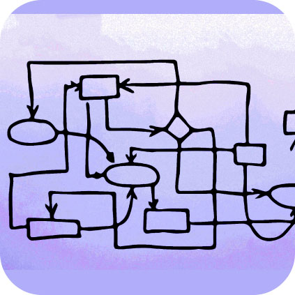
Visual clutter, info overload
Dense text blocks, excessive animations, and distracting visuals can be overwhelming for dyslexic individuals, making it difficult to focus on the essential content.
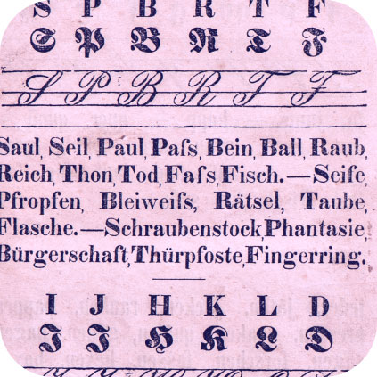
Complex fonts & text styling
Fonts with poor letter spacing, low contrast, or dense, intricate designs can make reading laborious, straining the eyes and hindering comprehension.

Lack of text formatting options
Inability to adjust font size, spacing, line height, or text background color can make reading less comfortable for anyone, with or without dyslexia, & does not allow for customization for individual needs.

Inconsistent navigation
Confusing site menus, unclear button labels, and non-linear layouts can make it difficult for any users to find their way around a page or site, leading to disorientation, frustration and lost time. Dyslexia adds to that difficulty.

No alternative content
Lack of audio descriptions for images, video captions, or text transcripts can obscure valuable information from dyslexic users who lean on auditory learning or alternative formats.
These and other issues that can come up when websites don’t take accessibility into account, like non-linear text that doesn’t follow a standard layout, or no text to speech tools, can make it distracting or downright impossible to find and understand digital information. Building and maintaining websites that are accessible to people with dyslexia and other disabilities is important; websites should be planned and adjusted to serve the needs of all users, including those with dyslexia. By incorporating accessibility features and adopting inclusive design principles, websites can become more welcoming and navigable for everyone, leading to a more equitable digital experience.
Digital Pathways: Assistive Tools for Dyslexia
Navigating the complexities of the digital world becomes exponentially easier for people who are dyslexic at any level when they can equip themselves with the right tools. A wide range of adaptive digital and analog tools and technology is available to help dyslexic readers connect text with comprehension, leading to better online experiences.
Key Adaptive Tools and Features
- Fonts & Typography: General
Fonts shape the reading experience. Some fonts, like Arial, while not specifically designed for dyslexia, share some characteristics that can make them a good choice for readers with dyslexia when more specially designed fonts are not available. - Sans-Serif
For a better reading experience, certainly online, it is recommended to use sans-serif fonts, that is, fonts that do not have decorative serifs at the ends of the strokes. These decorative embellishments can sometimes appear blurred or crowded to people with dyslexia. - Clear Letterforms
When each letter has a distinctly formed shape and avoids ambiguity, it is easier to recognize and differentiate between them. This is a good design choice across digital and print content. - Dyslexia-Specific Fonts
Dyslexia-optimized fonts that are meant to ease confusion for dyslexic readers, like OpenDyslexic or Lexie Readable, tend to have clean and clear letterforms, larger character spacing, and minimal embellishment, reducing visual confusion and improving reading fluency. These fonts may feature heavier bottom portions to help prevent the letters from appearing to flip or swap, and often also include subtle additional differentiations between letters that would otherwise appear ambiguous for people with dyslexia. - OpenDyslexic
This popular free font replaces easily confused letters with distinct features. Lowercase “b” and “d” have different tails, “p” has a distinct loop, and “g” has an open tail to avoid confusion with “q.” - Lexia Readable
This commercially available font uses subtle variations in letter shapes and spacing to enhance clarity and reduce confusion. Letters like “b” and “d” have distinct baselines, and letter spacing is optimized for better visual tracking. - DyslexieFont
This free font emphasizes clear letter shapes and avoids ambiguity. It uses thicker strokes, open counters (the spaces within letters), and distinct features like a closed tail for “q” and a curved descender for “g.” - Font Dyslexia
This free font utilizes various strategies to improve readability, including thicker strokes, clear letter differentiation, and subtle color variations within some letters. - EasyReader
This commercially available font incorporates multiple design strategies to combat dyslexia, including variations in letter shape, size, and weight, as well as subtle color differentiation.
It's important to note that not every font works for everyone with dyslexia, and trying out different options is always the surest way to succeed. Consider factors like individual preferences, reading level, and specific challenges when choosing a font. And, for teachers and parents of young people with dyslexia, as well as adults working around their own dyslexia, using these fonts in tandem with other dyslexia-friendly approaches, such as audiobooks and specialized tutoring, can maximize reading success.
- Background Colors & Contrast
Setting text against a light neutral or pastel-colored background can minimize visual strain and enhance focus. Adjustable color schemes allow users to personalize the visual environment based on their preferences. Some may prefer a stronger tone, or a reverse color scheme; white text on a dark background. - Text-to-Speech Tools
These tools convert written text into spoken audio, offering an alternative access point for information, and helping dyslexic users to better comprehend and retain information. Listening to the text read aloud can significantly improve comprehension and reduce eye and brain fatigue for dyslexic readers. Text-to-speech tools can be particularly useful for long texts. - Website Structure
Clear, logical website sequencing and architecture with proper use of headings, subheadings, and a straightforward menu design aids navigation and information retrieval for everyone, as well as dyslexic users. Short paragraphs and white space between text blocks further support readability. - Customization Options
When users can adjust font size, color, line spacing, and text-to-background contrast, they can create a more personalized reading environment that optimizes their comfort and reading efficiency, significantly improving accessibility for users with dyslexia.

A Deeper Dive into Digital Assistive Tools
Beyond built-in website features, adaptive and assistive digital tools can offer additional layers of support for users with and without various types and levels of disabilities.
- Browser Extensions
These small software programs are powerful tools that can modify web content by integrating with web browsers, offering features like text-to-speech functionality, grammar and spelling checks, font customization options, and dyslexia-friendly overlays. They can adjust colors and even reformat web pages to reduce visual clutter. Popular examples include Read&Write, Spreeder, and OpenDyslexic for Chrome. - Reading Overlays
These dyslexia reading tools are software applications that sit on top of existing text on websites or documents much like a pair of reading glasses or sunglasses, applying colored filters or highlighting text to improve clarity, reduce visual stress, and boost reading speed and accuracy. Reading overlays can be especially useful in managing visual distortions often experienced by dyslexic readers. Tools like Dyslexie, ColorDyslexia, and Lexilight are good examples in this category. - Bookmarklets
Similar to browser extensions, bookmarklets are small scripts added to the browser bookmarks bar. When clicked, they activate on the current webpage, offering features like text-to-speech conversion, font adjustments, or simplified page layouts, making the content more accessible for individuals with dyslexia. Examples include the Click & Speak bookmarklet from the National Center for Learning Disabilities.
Incorporating these adaptive tools and features into websites and other types of digital content, both online and off, developers, designers, web administrators, and business owners can make them more accessible and inclusive for everyone, offering dyslexic individuals fairer and more equal access to information and opportunities.

Best Practices for Dyslexia-Friendly Web Design
By incorporating best practices that address common challenges faced by dyslexic readers, you can transform your website into a smooth and navigable digital landscape. Let's look at some key areas and explore how they can be optimized for better accessibility:
What’s the Challenge? Resolving Dyslexic Access Blockers ▼ Page Clutter ▲ Embrace Clarity Visual disorder, excessive animations, and overwhelming layouts can create distraction and hinder focus for dyslexic users. A clean, uncluttered layout is crucial in dyslexia-friendly design. Simplify your design: Opt for clean layouts with ample white space and clearly separated sections. Avoid cramming too much information on a single page. Don’t use extraneous graphics.
Prioritize content hierarchy: Use clear, consistent, and correctly set headings, subheadings, and bullet points to structure information and guide the reader's eye through the content in a natural way.
Minimize distractions: Limit unnecessary animations, flashing elements, and background noise. Avoid overusing sidebars and pop-ups, which can be distracting and overwhelming. Plan to help users focus their attention on essential content.▼ Unclear Interaction & Navigation ▲ Keep Consistent Inconsistent navigation layouts and unclear button labels can cause confusion and disorientation for dyslexic users. Maintain a consistent navigation structure: Use the same menu layout and button styles throughout the website.
Opt for clear and concise labels: Avoid using jargon, abbreviations, or overly complex language for buttons and menu items.
Incorporate keyboard navigation: Check that all website elements are fully accessible and operable using keyboard controls.▼ Difficulties with Visual Text ▲ Offer Non-Text Alternatives Dyslexic readers have trouble reading visually, and may process information more effectively through alternative formats like audio or visuals. Are these formats available in your content? Integrate multimedia elements: Use images, videos, and infographics to break up text content and supplement information. Be sure to offer these elements accessibly, and in a way that does not interfere with existing content.
Provide alternative text descriptions: Describe the content of images and videos using clear and concise language, and make sure these descriptions are available to assistive technologies.
Add audio options: Consider incorporating text-to-speech functionality or audio recordings of written content. This may be simpler now with AI.▼ No Single Answer ▲ Allow for Different Strokes One-size-fits-all approaches often fall short for users with dyslexia, who may have individual preferences for font size, contrast, and layout. Offer adjustable font sizes and styles: Allow users to choose fonts that are easier to read for them.
Enable text-to-background color customization: Provide options for users to adjust color schemes based on their preferences.
Incorporate options to change text spacing and line height adjustments: Give users control over spacing and line height for improved readability.
Real-World Access: Dyslexia Solutions in Action
The following case studies showcase the best practices we’ve discussed.
- National Geographic Kids
A brand that nearly everyone is familiar with, this highly rated site is aimed at young readers, including those with dyslexia. It incorporates engaging multimedia elements like images, videos, and interactive quizzes.
★ Frequently updated resources for children to explore, encouraging learning.
- The British Dyslexia Association
A prime example of dyslexia-forward design, this site features a clean layout, high contrast between text and background, and uses dyslexia-friendly fonts. The website also offers a toolbar where users can customize their viewing experience, including changing font size and color schemes.
★ Advocates for early identification of dyslexia and other learning difficulties and offers school support for dyslexic learners, as well as multiple teaching and parenting resources.
- Dyslexia Scotland
This website showcases an excellent use of consistent navigation and interactive elements. The menus are straightforward, with clear labels and consistent location. Interactive elements are distinctly styled and respond interactively, providing clear feedback to users.
★ Offers a direct helpline and local resources for dyslexia assessments for adults and children.
- Khan Academy
This very popular, well-respected educational platform for students of all ages, from preschoolers to lifelong learners, prioritizes accessibility, offering adjustable font sizes, color themes, and text-to-speech functionality, so users can personalize their learning experience.
★ Clear, helpful, low-tech, with wide coverage of educational topics. The website also offers many free videos and other remote resources, and there is an app available for iOS and Android.
- Made By Dyslexia
A global charity led by successful dyslexics. The website offers an exceptional balance of multimedia and text. Videos are used effectively to convey information, and are supplemented by text alternatives. The site avoids autoplay features, giving users control of their multimedia experience: a critical aspect of accessibility for users with dyslexia.
★ Offers a free 1-hour course on leveraging the benefits of Dyslexic Thinking for schools and workplaces.
These practical live website examples demonstrate how thoughtful design significantly improves the online experience for people with dyslexia across many intersecting demographics.
The Why, and the Win-Win: Why Accessibility Matters
In today's digitally driven world, aside from upholding equality as a moral imperative, it is simply a smart bottom-line business decision to establish full digital and physical accessibility. Removing barriers and creating inclusive spaces unlocks a wealth of immediate and long-term benefits for individuals, businesses, and society as a whole.
Accessibility is also a legal requirement in many jurisdictions around the world. Adhering to internationally accepted standards like the Web Content Accessibility Guidelines (WCAG) set by the independent World Wide Web Consortium (W3C) standards organization and its Web Accessibility Initiative (WAI) helps in complying with laws such as the Americans with Disabilities Act (ADA), the UK’s Disability Discrimination Act (DDA), and the European Union member countries’ Web Accessibility Directive (WAD). Although websites and digital content that you or your teams produce may not be based in any of these regions, if it is consumed by people there, laws on digital accessibility may be applicable, and you could be liable for any violations.
Accessibility offers distinct human advantages including:
Equal Access & Engagement
More people can actively participate in education, employment, social interaction, and civic engagement, contributing their unique talents and perspectives.
Dignity & Independence
Remove existing barriers to access, and people with disabilities can navigate their lives with greater self-reliance. Accessibility builds a sense of dignity and autonomy.
Breaking Down Stigmas
Challenging and disproving societal biases and prejudices surrounding disability leads to understanding, empathy, and a more inclusive social fabric.
Innovation & Growth
A diverse user base brings a wider range of needs, perspectives, and experiences to the table, driving innovation and sparking solutions that benefit everyone.
Building in inclusive access for digital and physical environments rewards us all: individuals with and without disabilities, businesses and organizations, and society as a whole.

Business Benefits of Digital Inclusion: Why Accessibility Makes a Difference
Digital accessibility and inclusion are powerful business drivers that can welcome diverse talent, expand customer reach, and boost brand reputation. Together, they make up a strategic investment with tangible benefits, such as:
- Expanded Audience, Broader Market Reach: The disability community is currently estimated at over 1 billion people globally; accessible businesses tap into a vast and often overlooked market segment, increasing their customer base and potential revenue.
- Enhanced Brand Reputation: Committing to accessibility demonstrates social responsibility and a strong moral ethic, boosting brand image and attracting customers, employees, and partners who value these principles.
- Improved Search Engine Optimization (SEO): Many accessibility features align with SEO best practices, leading to higher website ranking and increased organic traffic.
- Increased User Engagement: Accessible websites and applications with clear navigation and user-friendly features create a better user experience for everyone, leading to longer engagement times and higher conversion rates.
- Reduced Legal Risk: Adhering to accessibility guidelines helps mitigate the increasing risk of disability discrimination lawsuits, and the associated financial penalties, added costs, and reputational damage.
- Slashed Design & Development Costs: Implementing accessibility from the outset is inevitably more cost-effective than retrofitting an already-built website or physical space.
- Accelerated Innovation & Market Leadership: Businesses that prioritize accessibility and inclusivity often lead in innovation, setting standards in their industry. This forward-thinking approach can give companies a competitive edge.
In short, accessibility should be an integral part of the planning and development process for organizations, not an afterthought: it is an essential ingredient for building successful and sustainable businesses and online presences. When the planning stages have come and gone, and you are tasked with making adjustments to an imperfect environment, that’s a good goal, too. As the saying goes: “Start where you are. Use what you have. Do what you can.” Attributed to Arthur Ashe, the idea isn’t new: it’s a classic recipe for success. It’s how we make it happen.
Building More Equal Spaces, Here & Now
Instead of merely wishing for a more inclusive world and a better future, we can build that future in the present, laying the groundwork now. We humans have so much more to give each other, individually and collectively: talents, skills, hope, collaboration. We shouldn’t let barriers to access based on physical or cognitive limitations stand in the way of this limitless vision. Using the tools we have available, integrating accessibility is a realistic possibility and a reachable goal. Working together, we can fill in the missing pieces, inventing even better tools and greater capabilities along the way. Recognizing the tremendous potential of each person and removing the obstacles blocking them from realizing it is how we all get to the future of our dreams.
FAQs
My website already seems usable. Why prioritize dyslexia-specific accessibility?
While your website might function well for most, even minor design choices can create hurdles for dyslexic users. Implementing dyslexia-friendly features makes for a better experience for all users, not just those with dyslexia; it creates an inclusive space that welcomes a wider audience and prioritizes user comfort.
Are there tools available to help me make my website more dyslexia-friendly?
Yes, you can find multiple resources, browser extensions, and website analysis tools with a quick online search. Exploring and leveraging your options and combining them strategically can simplify and fast-track your journey to accessibility for users with dyslexia and other impairments.
Will accessibility changes change the overall design of my website or web application?
Possibly, in a good way. The first rule of design is that form follows function, or in other words, when it works, it will look good, too. Dyslexia-friendly choices that prioritize readability and navigability like clear layouts, ample white space, and uncluttered visuals are sure to improve the overall user experience for everyone.
How can I tell if my dyslexia-friendly changes are working?
Ask someone with dyslexia! User testing by people who have dyslexia is the most direct way to gauge the effectiveness of your efforts. And, website analytics tools can track metrics like time spent on pages, bounce rates, and user engagement, potentially revealing positive changes after implementing accessibility features.
Can you suggest a good resource for students with dyslexia?
A hidden gem that more people with dyslexia, as well as parents and teachers of dyslexic students, should know about is the National Library Service for the Blind and Print Disabled (NLS). A part of the Library of Congress, it not only provides services for people who are blind or visually impaired, it also has options for people with dyslexia and reading disabilities. In addition to medical professionals such as doctors, new additions to the list of authorities who can certify applicant eligibility include librarians, reading specialists, educators, and school psychologists. This has made it much easier to enroll in NLS and enjoy free services and accessible reading materials.
