Composing UI Design for Color Blind Accessibility Guidelines
Making User Interfaces Work for Color-Blind Users
Picture this: you're browsing a travel website, looking for a fun, affordable getaway, cruising through some cool options. Suddenly the “Book Now” button vanishes into the background, and important details blur in a confusing mess of colors. Now you’re stuck on the page and stranded at your desk, without a vacation plan. Ouch.
 Advertisement
That's a frequent experience for millions of people with color blindness. It’s a daily struggle that doesn’t have to happen. If you’re a digital designer or web administrator, you don’t want to do that to your site visitors, either. And if you’re a business owner, you’ve just lost a customer, and set yourself up for possible legal problems.
What happens when color blindness is not taken into account by web and digital designers? It's not just annoying, it's a real barrier to accessing information and connecting with the world online. However, here's the good news: building a website or web app that works for everyone isn't an impossible mission. It’s not even that daunting a task. Color accessibility is simply one more design tool to add to your skillset. Once you’ve read through and practiced a few tips and tricks, you’ll get in the habit of palette and contrast checking, so the websites you design are friendly for all eyes.
Where Do I Start? What About My Mood Board?
If you’ve studied design, or if it’s an interest of yours, you already know that color means so much more than whatever’s trending on socials as the latest aesthetic. Designing a successful brick and mortar storefront would involve more than just slapping on some red paint and assuming the bright color draws enough attention. A smart designer, or any store owner with practical common sense, would add clear signage that tells people what’s being offered and where they should go, perhaps something as simple as “Ring Bell for Service” above a doorbell. And you’d want to check that people could find the bell and the sign in all that splashy candy-apple color, as well.
In the digital world, your best bet is to set up your content and navigation in a readable, logical way, so anyone can browse your website with ease. When you keep colors clear and contrast sharp, your site visitors or app users can figure out what you’re trying to tell them, interact with the functionality as intended, and find their way through without tripping over unnecessary visual obstacles… no matter how they see the world.
In the next few paragraphs, we’ll break down color accessibility into simple steps: from understanding different types of color blindness to picking colors that work, and using the right tools to check your results. Let's build digital environments that are bright, inclusive, and welcoming to everyone, accessibly.
Colors Collide: Beyond the Rainbow
Affecting roughly 8% of men and 0.5% of women globally, the percentage of color blindness may sound relatively low, but the numbers are significant: out of approximately 8 billion humans, 8% is 624 million, and .5% is still a solid 4 million, for a total of 628 million people with color blindness.
What is Color?
First, let’s talk about how the eye sees color. It starts with light, and our sun is the main source of the light we see.
A child’s drawing of sun rays tends to show light beams in straight lines. That isn’t inaccurate, but it isn’t the full picture. Light from the sun comes in waves, with peaks and valleys, similarly to how sound travels. There are a lot of kinds of light, and we humans aren’t able to see most of them. Visible light is a very small part of the spectrum. The rest of the sun’s light waves include X-rays, ultraviolet, radio, microwave, and other types of waves that are invisible.
Waves of light come in different lengths. These wavelengths are colors. White light combines all of them.
How does color become visible? When a ray of light touches an object, say a leaf for example, the object absorbs most of the wavelengths and reflects the rest of them. The reflected wavelengths are the colors we can see bouncing off the object. If the object is a green leaf, the leaf will reflect back the green wavelengths, and absorb the rest.
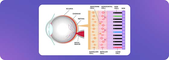
The Eyes Have It: Retina, Rods and Cones
If you recall the structure of the eye from science class, the retina at the back of the eye has rods and cones. Specific rods and cones react to different wavelengths, or colors. Light reaching the retina’s rods and cones causes electrical signals to travel through the optic nerve to the brain. The signals are sorted and processed, and sent on to the visual cortex. Different cells in the visual cortex react to information including shape, motion, color, and more, and the whole image is formed by compiling these recognized signals. With information like learned memory and reactions connected to emotion added in another part of the brain, we can recognize and understand what we’re seeing.
Causes and Kinds of Color Blindness
Most color blindness is genetic, that is, inherited. Some people can become color blind due to diseases like diabetes, or as a result of aging, or from taking certain drugs or medications.
Red and green color blindness is the most common form of color blindness, although the red/green category also includes different types within it, as well as levels of severity.
It is important to remember that if a person cannot see or cannot differentiate between red and green, that also affects their perception of other colors that have red or green mixed into them. Purple, which is a combination of red and blue, will not show up as purple, because the red is not distinguishable.
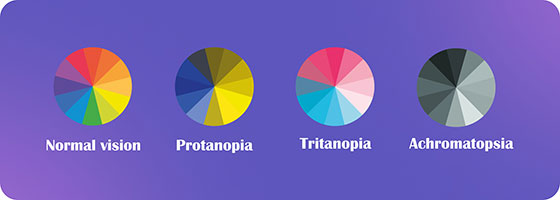
Color Blindness Types & Terms
Trichromacy
Ordinary vision uses all three types of cone cells, if all the cells are working as they should. Trichromacy is not a form of color blindness. It is average functioning color vision, but it is important to understand it as a starting point. Chroma refers to pure color, and with three (tri) color cone cells working together, all colors are seen in the usual way.
- Anomalous Trichromacy
We can hear “anomaly” in this word, and we’ll find it again in the terms below. It means “not the usual.”
For people with anomalous trichromacy color blindness, all three types of cone cell in the retina are in use. However, one type of cone cell is out of alignment.
Within this condition are three color blindness effects, depending on the kind of cone cell.
- Protanomaly
In this case, the change in function is a lower sensitivity to red light wavelengths. - Deuteranomaly
This is the most common type of color blindness. It is a lower sensitivity to green light. - Tritanomaly
This is a very rare type of color blindness. The lower sensitivity here is to blue light.
- Protanomaly
- Dichromacy
In this type of vision, only two of the kinds of cone cells in the retina are able to pick up color wavelengths. One segment of the light spectrum is not seen at all. These segments of the spectrum are called red, green, and blue, although the red and green wavelengths have a great deal of overlap. This is why red/green color blindness is categorized this way, and it also means that people who have either red or green color blindness will have similar vision results.
- Protanopia
In this type of color blindness, red light wavelengths are not seen at all. - Deuteranopia
Green light cannot be seen with this type of vision. - Tritanopia
For this type of dichromatic color blindness, blue light is not visible.
- Protanopia
- Monochromacy
This is seeing only in shades of gray. Total lack of color perception, known as monochromacy or achromatopsia, leads to seeing a black and white image, like an old movie. This is a very rare form of color blindness. In some cases, people may believe that they have “total” color vision loss, if they have been incorrectly diagnosed by an optician or optometrist who has received little training on color blindness. This misdiagnosis is most often a result of a misinterpretation of a color blindness test, called an Ishihara test.

Considering how color blindness affects people’s lives, it is clear that color blindness is more than a minor visual quirk; it's a significant barrier to equal access in daily life, and it can be an absolute roadblock in our increasingly digital world. Websites and apps that rely solely on color cues for navigation or functionality leave users with color blindness high and dry, with no way to move forward. Essential buttons vanish, warnings go unseen, and entire sections are lost in the confusing fog of poor color choices. This is a critical issue that hinders user experience, violates accessibility principles and guidelines, and excludes a sizable portion of the population.
Color Blind Accessibility: A Web Without Walls
For millions of people with color blindness, navigating the digital domain becomes a frustrating obstacle course, where color cues intended to guide blend into each other and cause only confusion. Websites and apps relying solely on color coding for functional and directive information are completely inaccessible to people with color blindness.
Learning and understanding key color blindness accessibility requirements equips you with the tools to craft interfaces that welcome everyone, regardless of their color vision.
Getting to Know Accessibility Standards
- WCAG
The WCAG (Web Content Accessibility Guidelines) are the internationally recognized standard for foundational accessibility. This is where minimum contrast ratios for text and backgrounds are determined, delineating readability levels for all users. Most accessibility laws around the world are based on the WCAG, including the Americans with Disabilities Act in the United States. The ADA guidance for color blindness likewise uses the WCAG as a reference. - Mobile Apps
Platforms like iOS and Android each have their own accessibility roadmap to address the unique challenges of touch interfaces and smaller screens. It’s a slightly different set of standards, but the color theory remains the same, and so does the goal: creating and maintaining a smooth journey for all users. - Regional Regulations
Research local standards before you launch to check that your website or app complies with accessibility laws for the regions where your users are located.
Smart Design for Color Blind Accessibility
Websites and apps can be designed with vibrant color that is well-defined, welcoming and accessible to everyone, regardless of their color vision. This is achievable when we use and constantly consult the principles of color-blind accessibility, making simple, impactful design choices starting with core design elements:
- Friendly Palettes for Color Blindness
Start with color in the early planning stages. Rule number one here is not to use red and green together. Avoid what’s called the “stoplight” palette: the classic traffic light red, green and yellow that many people use. However, it is not necessary to totally avoid any shade of red and green. The key to building an accessible color palette that works is remembering the combinations of colors that can be misread. While a person who has one form of color blindness might not see green, they can still see contrasting colors as different from each other, for example as varying shades of brown. By using a color blindness simulator, you can see how colors and their combinations look for people with different types of color blindness, such as deuteranope and protanope types. - Clear Contrasts, Easy Reading
When text and background colors work together in highly contrasting combinations, information leaps off the screen. Read up on and follow WCAG guidelines to confirm that you have set colors in sufficient contrast ratios, making essentials like text and buttons crystal clear for everyone. Tools like color contrast checkers can become your allies in finding successful palettes. Compare and consider complementary colors with significant brightness differences, like blue and orange, for optimal visibility. It is also critical to avoid color combinations that are not distinguishable for users with color blindness. - Discreet Pattern Usage
While not always the right design choice, discreet and careful use of pattern and texture can add to content readability and navigation ease. In recent updates to subway maps, for example the London Underground, repeating line patterns with dashes and dots are used to differentiate between train lines, in addition to color coding. In data visualizations, adding a texture to a bar or pie chart segment can clearly show where important informational elements begin and end. Adding a white outline to chart or map segments can also help. And, test your charts, graphs and maps in a color blindness simulator tool before you publish them. - Adding Text & Visual Cues
When designing forms and interactive elements, it is especially important to move past the typical uses of red or green color to indicate whether information is missing, or when a task has been finalized. Adding text labels is extremely helpful for color blind users, and if these text labels are set to be readable by screen readers, they are also an important accessibility feature for people with other visual impairments including blindness. And, adding a visual success or fail icon, like a checkmark or an X, can easily show people with color blindness whether they have completed a task.
3 Tools for Digital Color Accessibility
Let's explore some helpful resources for color-blind accessibility. These practical tools help make your interfaces color-blindness compatible and accessible for more users.
- Colorblind Web Page Filter
This browser extension lets you instantly view any website through the lens of different color blindness types. It's a powerful tool, giving you a firsthand experience of how specific color choices impact user navigation. - Sim Daltonism
This simple yet comprehensive open-source Apple-compatible tool simulates various types of color blindness, offering real-time previews of your design decisions across the spectrum. It offers detailed controls for specific types of vision deficiencies, and adjustment options by color filter and by intensity level, providing a nuanced understanding of potential challenges for users.
Benefits: This tool is easy, intuitive, versatile, free, and open source. - Color Oracle
Another valuable simulator, this tool works with Windows, Mac and Linux. It offers intuitive controls and various preset color blindness types. Its preview feature makes it ideal for quick adjustments on the fly to gauge the impact of your color choices. However, there is no real-time adjustment option.
Benefits: This tool is online, so no download is needed. It supports image upload and can read URLs.
While both Sim Daltonism and Color Oracle excel at simulating color blindness, they are slightly different.
Ultimately, the best tool is the one you'll use consistently. And, of course, your tool of choice will also depend to some extend on your operating system. Experiment with both Sim Daltonism and Color Oracle, and check out some other color blindness simulator options, to find the one that fits your workflow and preferences. All of these tools can be used to craft truly inclusive experiences for everyone.
Decoding Color Vision: Overlay Solutions
While building websites with intrinsic “from the ground up” accessibility remains the ultimate goal, website overlays can often serve as valuable allies in the quest for inclusivity. It isn’t always possible to to rebuild websites and web apps in the time frame and budgets available. In the interim, and as an additional help for large and complex websites, overlays can serve in a way that’s parallel to glasses rather than laser eye surgery, offering a layer of better readability for users with color blindness as well as other disabilities.
What are some of the immediate benefits accessibility overlays can provide for users with color blindness?
Instant Color Adjustments
Overlays can adjust color palettes, amplifying contrast ratios between text and background elements. This allows vital information to pop off the screen, smoothing the reading experience for everyone.
Visual Cues for Easier Navigation
Some overlays add subtle outlines or highlighted borders around buttons, forms, and other interactive elements. This provides additional visual cues, guiding users with color blindness through the digital landscape with greater ease and confidence.
User Customization
Many overlays offer a range of options, offering users ways to quickly custom-tailor their viewing experience and choose the color adjustments that best suit their specific needs. End users can actively personalize their online journey for their optimal comfort and clarity.
While website overlays are not currently built to be a definitive solution that can cover all accessibility compliance, they offer a flexible and readily available toolset for boosting and quickly improving accessibility. They can serve as a supportive bridge, moving us all towards a more inclusive digital future where everyone can navigate the web with ease and enjoyment.
Color Blind Accessibility Testing Tools
While design principles and simulators offer valuable insights, nothing can compare to seeing your website through the eyes of users with color blindness. But how do you test for accessibility beyond your own perspective? Here are some helpful color blind web accessibility testing tools:
Color Blindness Accessibility Checker Tools
Tools like WAVE and Lighthouse scan your website for potential color contrast issues, highlighting areas that might fall short for users with different types of color blindness.
Browser Extensions
Extensions like Colorblind Web Page Filter and Sim Daltonism let you instantly view your website through the lens of specific color blindnesses, offering a real-time glimpse into potential challenges users might face.
Mobile Apps
Apps like Coblis and ChromaVision provide on-the-go color vision simulation, allowing you to test your website's accessibility anywhere, anytime.
These tools are fantastic starting points, but bear in mind that they are not a substitute for actual user testing.
Real-World Testing with Color-Blind Users
The truest test of your website's accessibility lies in the hands of real users with color blindness. Inviting them to test your website and observe firsthand how they interact with it is invaluable. Here's why:
Uncover Unforeseen Issues
Tools might miss subtle issues, but users will encounter real-world challenges like confusing button blends or unclear error messages. Their feedback provides invaluable insights for improvement.
Empathy in Action
Witnessing firsthand how your website might impede someone's experience cultivates empathy and motivates you to go the extra mile for inclusivity.
Building Bridges, Not Walls
Engaging with color-blind users is a chance to learn from their perspectives and build a website that truly welcomes everyone, regardless of their visual abilities.
Accessibility means more than checking off items on a to-do list. Real accessibility means building bridges of understanding and inclusion. By utilizing testing tools and actively involving color-blind users, you can make your website work well for everyone, creating a digital landscape where everyone feels welcome to explore.
Digital Landscapes for Every Eye
Color blindness shouldn't be a digital roadblock. Millions face frustration and exclusion online due to inaccessible design. The solution is simple: prioritize high contrast, clear patterns, and accessible text. Every step towards accessibility opens doors, expands opportunities, and raises up unheard voices. Let's build a web where everyone can navigate with ease, share their stories, and connect without barriers.
FAQs
Can I just use color blindness simulators to test my website?
Simulators provide valuable insights, but they don’t show the whole picture. Real-world testing with color-blind users reveals unforeseen challenges, like confusing button layouts or unclear error messages. Consider both simulator testing and user involvement, as well as using other accessibility tools and testing, for a comprehensive and accurate accessibility assessment.
Do all types of color blindness require the same design changes?
There are several types of color blindness, each affecting how individuals perceive hues. High contrast principles generally benefit everyone, but specific adjustments might be needed for different vision deficiencies. Consider using resources like the APCA “Understanding Color Vision Deficiencies” to tailor your design choices.
My website uses a lot of images. How can I make them accessible for color-blind users?
First, ensure image content isn't solely reliant on color for understanding. Add alternative text descriptions that clearly explain the image's meaning. You can also utilize tools like image color analyzers to identify potential clashes with common types of color blindness. Consider offering options for adjusting image color or brightness to further enhance accessibility.
My website is already live. Can I still make it color-blind friendly?
While designing or redesigning for accessibility is ideal, there are still steps you can take now and at any time. Start by analyzing your website's color combinations using accessibility checkers and then prioritize adjusting high-contrast areas like text and backgrounds. Utilize accessible iconography and consider adding hover states or subtle outlines to buttons and interactive elements for better differentiation.
I find resources and inspiration for designing for color-blind accessibility?
Several organizations like the W3C Web Accessibility Initiative (WAI) and the American Printing House for the Blind (APH) offer comprehensive resources and guidelines. Design communities like A11Y Project and Smashing Magazine often feature insightful articles and case studies. Remember, even small accessibility improvements can make a big difference for millions of users, so keep learning and keep inclusivity at the forefront of your design decisions.


